Let there be colour! Dulux Colour Awards see beige and charcoals recede into the past
Dulux’s annual Colour Awards is one of the few competitions outside of the mainstream architecture and interior award programs that create a real buzz, both for the practitioners who enter and win and for the interested public who get to see what’s hyper chic in the contemporary paint spectrum.
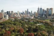
Winners in the six categories of 2022 were announced at a gala held in Melbourne last week and they definitely demonstrated that safe beige, bland tone-on-tone schemes, and the all-dominant greys, charcoals and blacks of the past decade are receding into irrelevance.
Instead, according to Dulux colour and communications manager Andrea Lucena-Orr, “this year we saw colour strategies that challenged stereotypes”.
Among what she called boundary-pushing applications of colour, why shouldn’t a highly technical university laboratory come dressed in almost domestically-comforting shades of pale and darker greens, in a steely blue and a hot ginger?
For designing the form and specifying the makeover of The Monash Robotics Lab at the university’s main Clayton campus, Melbourne’s Studio Bright emerged as the Grand Prix winner, and with the commercial interior – public and hospitality award for a project the judges called “utterly striking for its unexpectedness”.
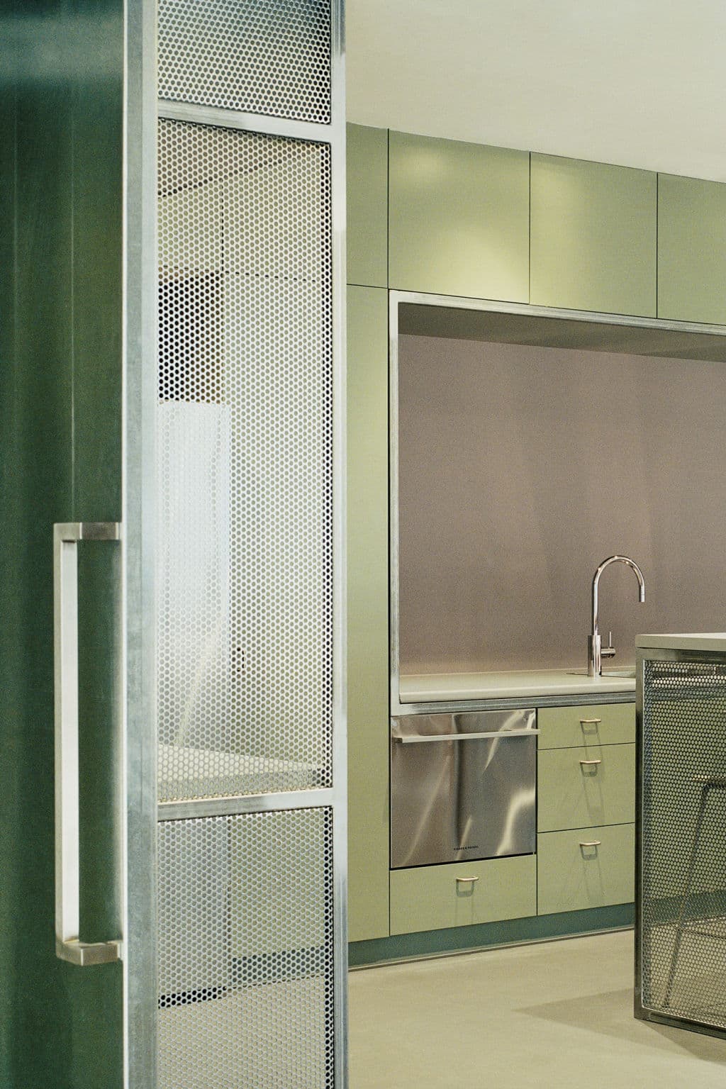
Aesthetically, they added, “the specified palette is refined and elegant”. So much so that white lab coats would look fairly ridiculous in the setting.
The hard-working Studio Bright was also commended in the categories of single residential interiors and exteriors for the earthy and blush tonalities of the scheme it specified for Autumn House, also in Melbourne.
In the bumper finalist list of 103 that was culled out of the entries that came from both Australia and New Zealand, this 36th annual Dulux Award really did show up the creators of three-dimensional spaces as what Lucena-Orr claimed was “a true testament to design professionals’ mastery of colour as an integral design tool”.
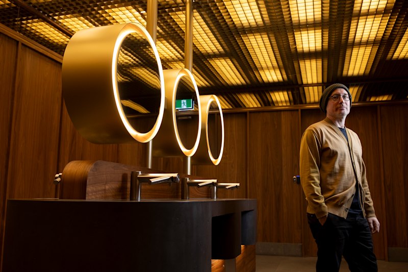
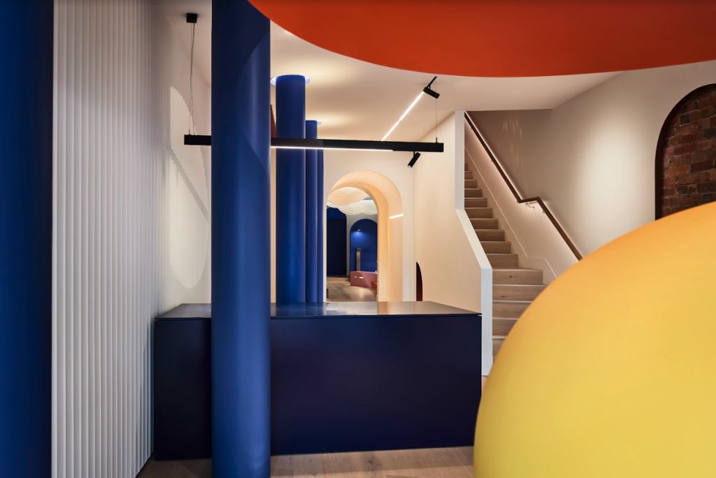
Nailing that to perfection is the shop set-up Melbourne’s IF Architecture mounted for a sophisticated lighting retailer, Lux FX, that won the studio the commercial interior – workplace and retail award.
For Lux’s main road Collingwood showroom, IF made what is a three-dimensional surrealist composition in which, said the judges, “primary colours meet primary forms”. The strong shades that further pay homage to Le Corbusier, are Sulphur (yellow), Ducal Pink and Mystification (the blue).
“We were unanimous”, said the judges “it is a highly successful, surprisingly nuanced project”.
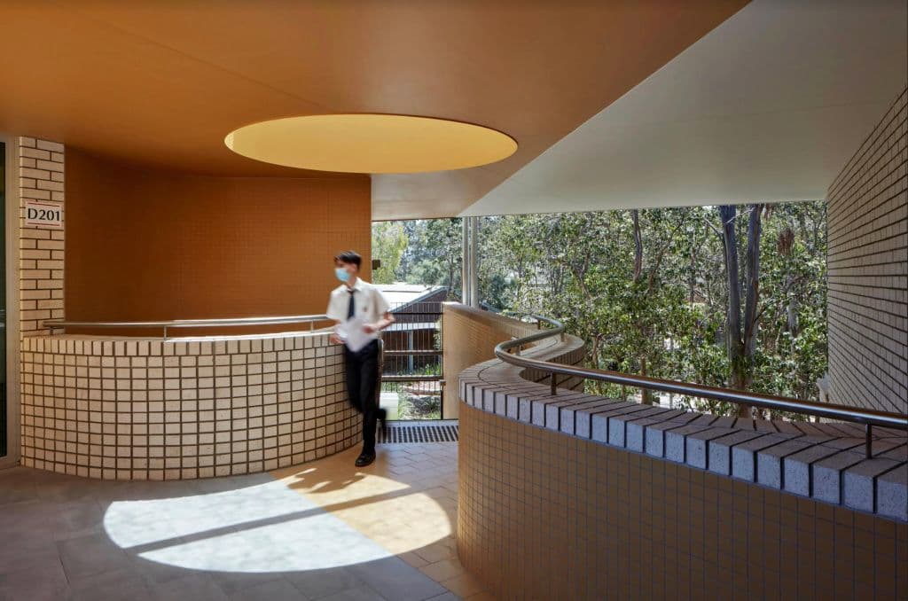
Another winner also coming from a studio that never hesitates to stretch for original outcomes is Brisbane’s Reddog Architects. For the golds, muddy pinks, brick tones, blues and greys it added to the new pale mortar building at the Cannon Hill Anglican College in Brisbane, the practice won the commercial multi-residential exterior award.
What that colour combination does in the school is integrate a new structure into the established bushland setting. And, said the judges, it also shows how “the rise of colour in educational settings cannot be underestimated”.
It wasn’t a winner as such but like so many of the finalists in every year’s Dulux competition, it deserves a second look if for nothing else the unforgettable entry corridor of a new Melbourne restaurant. It heralds one of the strong lines of directionality that was coming through the ever-evolving spectrum of applied colours even before the Queen’s jubilee featured them so prominently.
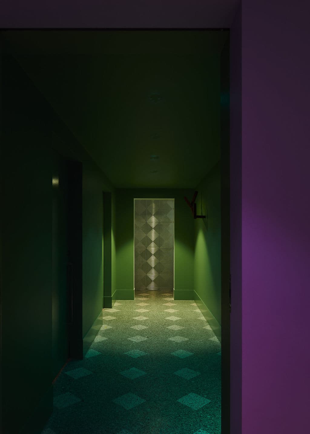
For his third outing, this time a refined pizzeria that is soft on the inside and almost an incidental discovery of some place down a back lane in old Rome or Naples, in his intimate new Carlton premises, Rinaldo “Ronnie” Di Stasio allowed Hassell to have their way in a manner the judges presented with a commendation because, they said, it becomes an indelible imprint in memory. “Such is its level of originality and theatricality.”
They added that “unlike any other restaurant design, this feels quite futuristic in its bold integration of art and colour, especially the brave, innovative use of green and purple”.
Strong, almost iridescent purple combined with clear magenta was also to the fore in the project that won University of New South Wales student Evelyn Wijaya the student award for 2022.
If you want to find loads more inspiration, the full chart of finalists for this year can be found on their website.