Dulux Colour Awards 2016: Top honours for former condensed milk factory in Queensland
The bold and thoughtful ways designers are bringing colour into commerce were on show as the winners of the 2016 Dulux Colour Awards were revealed, with the winning entries mixing retro elements with boundary-pushing palettes.
Using colour to evoke history and place, plus the use of fresh combinations of hues, unanimously impressed the judges of the awards, which were presented in Melbourne on Thursday night.
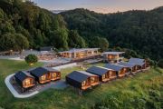
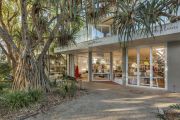
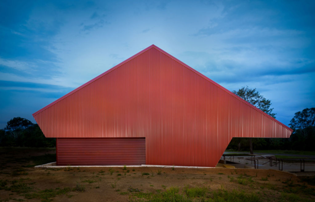
A 1920s packing shed in Queensland, part of a former Nestle condensed milk factory but now an art gallery and workshop, earned top honours.
Located in Toogoolawah, The Condensery, by PHAB Architects, took the Grand Prix, the award given to the best built project among the category winners.
Winning praise for the application of a single colour in various shades, and sense of continuity both inside and out, the project also won the Commercial Exterior category and was highly commended in the Commercial Interior (Public Spaces and Hospitality) category.
The Condensery, Queensland
 The Condensery. Photo: Manson Images
Awards: Grand Prix; Commercial Exterior; Commercial Interior Public Space and Hospitality (commendation)
Project: The Condensery – Somerset Regional Art Gallery
Architect: PHAB Architects.
This project used colour as a reminder of the site’s history. The judges said: “This project was awarded for its exceptionally clever application of a sole colour in varying shades, seamlessly executed to showcase a beautiful continuity both inside and out.
“Using an array of reds to tempt any palette from deep oxides to redish pinks, results in incredible beauty against the rural landscape. The Condensery tells an interesting layered story, whilst honouring the original architecture and history of the building.
“The exterior and interior work in complete harmony with each other, using traditional and contemporary colours in an equally brave and restrained manner, achieving perfect balance and simple balance.”
Dulux Lime White, Dulux Bombay Pink, Dulux Red Leather, Dulux Deep Garnet, Dulux Indian Red, Dulux Red Oxide, Dulux Deep Leather are the featured colours.
The Alex Hotel, Perth
 The Alex Hotel. Photo: Anson Smart
Award: Commercial Interior (Public Spaces and Hospitality)
Project: Alex Hotel
Architect: Arent & Pyke
This hip boutique Perth hotel was designed around the idea of “hotel as home”, a concept reflected in the colour palette. As the judges said: “The Alex Hotel is an example of how a strategic yet subtle approach to colour can result in effortless sophistication.”
“Raw and refined, a beautiful, unusual palette evokes a sense of relaxation and serenity with clever and well thought out precision, creating a homely and immersive environment. Arent & Pyke has committed and executed a colour palette that could have been disastrous in the wrong hands!”
Dulux Rosetta, Dulux Ginger Crunch, Dulux Dreamland, Dulux Deep Sun, Dulux Amazon Depths, Dulux Vivid White, Dulux Grey Pebble, Dulux Tranquil Green are the featured colours.
The Doctor’s Studio, Melbourne
 The Doctor’s Studio. Photo: Sarah Anderson
Award: Commercial Interior (Office Fitout and Retail)
Project: The Doctor’s Studio
Architect: Russell & George
This doctor’s studio eschews the conventional white minimalist or beige waiting room for something a little more in your face.
“The Doctor’s Studio is an extremely forward thinking and provocative project that pushes the boundaries with an original display of colour with an uplifting palette,” the judges said.
“Russell & George has shown a true commitment to colours throughout the interior in a very luxurious manner, achieving an effortlessly unique and natural look.
A combination rarely put together so successfully, The Doctor’s Studio really is a new, fresh take on a clinical interior.”
The Doctor’s Studio, a Victorian project, features Dulux Tuscan Sunset, Dulux Sea Radish, Dulux Natural Light.
Empire Cinema, Wellington
 Empire Cinema and Eatery. Photo: Luke Calder Photography
Awards: International; Commercial Exterior (commendation)
Project: Empire Cinema
Architect/Design Practice: Archaus
You go to the cinema for theatre, and that’s exactly what this colour palette achieves in an art deco building in Wellington, New Zealand.
“One of the most impressive before and after restorations, the Empire Cinema is a great example of an inspiring conservation project that has been transformed using colour dedication,” the judges said.
“The bold palette respects the heart of the old building with colours that revitalise and create an iconic, Baz Luhrmann-esque vibe. Archaus has embraced the era, celebrating the buildings theatrical presence and function.”
Dulux Cherry Wood, Dulux Maheono Half, Dulux Masterton are the featured colours.
- A full list of winners and commendations can be seen at dulux.com.au/colourawards.
The judging panel
Meryl Hare – Principal at Hare + Klein Interior Design
Clare Cousins – Director at Clare Cousins Architects
James Harper – Principal at BrookingHarper and Director at Design Institute of Australia
Matt Gibson – Director at Matt Gibson Architecture + Design
Alex Fulton – Director at Alex Fulton Design (NZ)
